ANA COVID TRAINING PAGE & APP CONCEPT
TOOLS: UXPIN, ADOBE CREATIVE SUITE
THE CLIENT
Client: ANA Enterprise
Role: UX Designer
Date: Q4 2020 to present.
I was tasked to redevelop ANA in partnership with the CDC’s Project FirstLine COVID training resource microsite. Given delays to roll out of the training resources, and the ever-shifting reality of the COVID-19 pandemic, the internal approach to the microsite had changed from providing training resources to keeping users (defined as busy nurses in hospitals, private practice, hospice, etc) engaged with the product. Working with existing branding and a constrained scope, I redesigned the page to engage and retain users while seeding for future growth and different ways of consuming the material.

ANA Project Firstline training page: Before
THE CHALLENGE
Leveraging existing user research, branding, and client-approved content, I was tasked to create a scalable design that can handle low-levels of content but be able to easily handle increased content, content types, and user consumption pathways.
THE RESEARCH
The current site had gone through a number of incremental redesigns over the course of 2020 and was a mishmash of approaches, each trying to solve for one individual problem rather than looking at the entire user experience as a singular journey.
An additional complexity was lurking behind the scenes: the iterative approach created a backend nightmare for the client managing the content, while at the same time creating new content as it came in from the CDC. Individual links and content pieces had to be updated manually, even if they looked and behaved the same from the users point of view.
I first examined the original design brief to understand who the users were: busy nurses, working on teams, and in shifts, as well as hospital administrators looking for reliable, vetted and, most important, free training for their nursing staff.
I then followed the trail of change orders to understand the delays, and impacts, of the content delivery and what that means for users accessing this site.
Finally, I discussed the impact of this shifting landscape with both the client (content managers) and the development team, which had to constantly re-build the site to support the incremental changes.

ANA Project Firstline: Proposed homepage design (in development)
THE OUTCOME
Users needed an engaging, scannable experience that proves the value of coming to this page and signing up to be notified of updates. Content managers needed an extensible design that they can logically add to over time, without having to come back to developers for every update.
Navigation
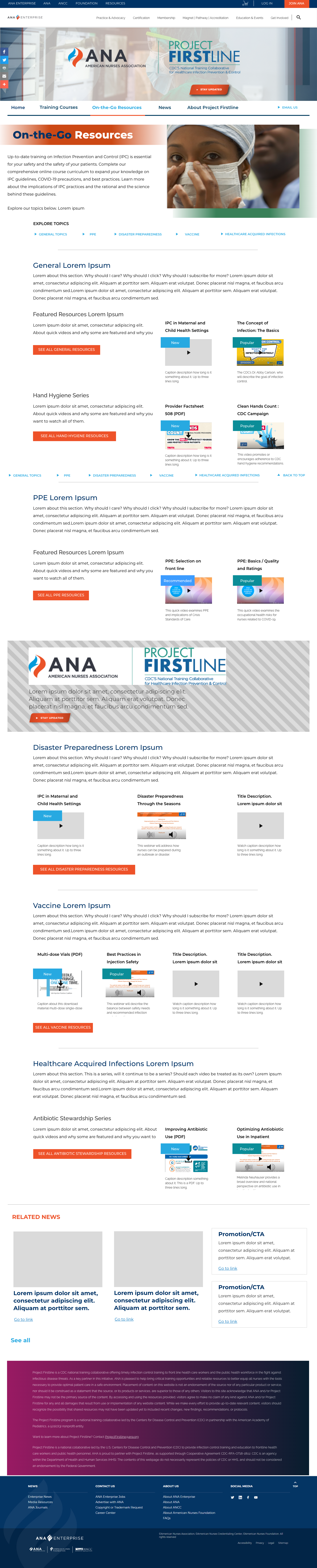
Taking the existing pieces and knowing my users, I created a simplified and shorter page that follow a more logical user journey. I truncated the journey to just five starting pages:
ANA | PFL Home
Training/Courses
On-the-Go Resources
News
About PFL
To navigate through the microsite, I recommended a bold horizontal nav bar that does not compete with the two other site navigations on the page. Each section then also links back and forth to allow users to cruise through the offerings and prove that this is a valuable resource to sign up for.
Promotion
The original design had small pathways and little clickpoints scattered throughout the pages that distracted from the current message to sign up. I took each of these small buttons and created an individual interrupter component that can be easily updated by the client to promote anything about the site, on every page.
I also discovered a promotion block and news block on some interior pages that I elevated to the homepage to replace the generic (or empty!) social proof to include news and updates that are immediately relevant to users coming to or returning to the page. Additionally, I discussed with the backend team if this can be done programmatically (ie, “feature newest news in 30 days first”) to save time on content managers having to manually input or select content for these blocks.
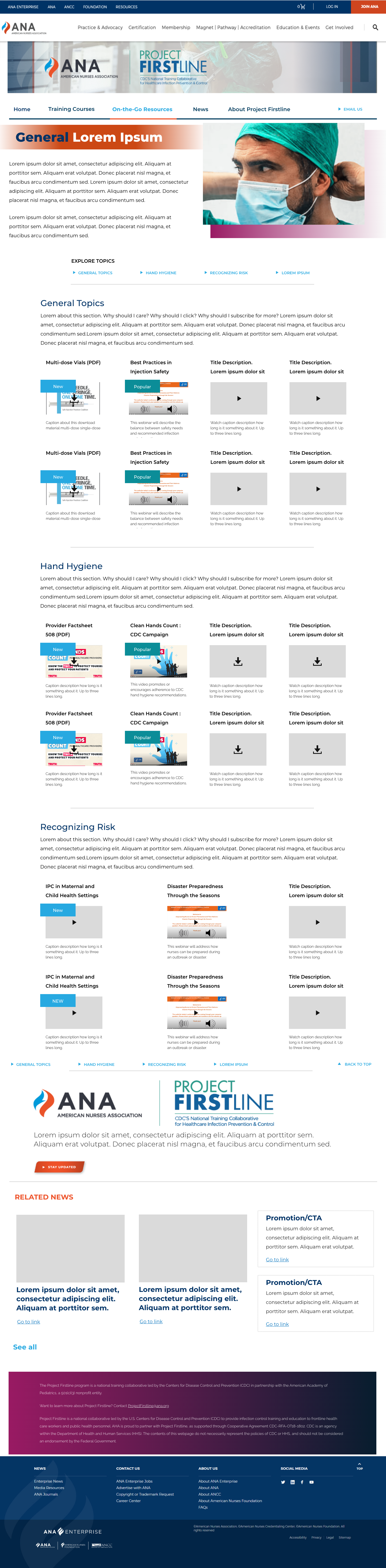
User Journey
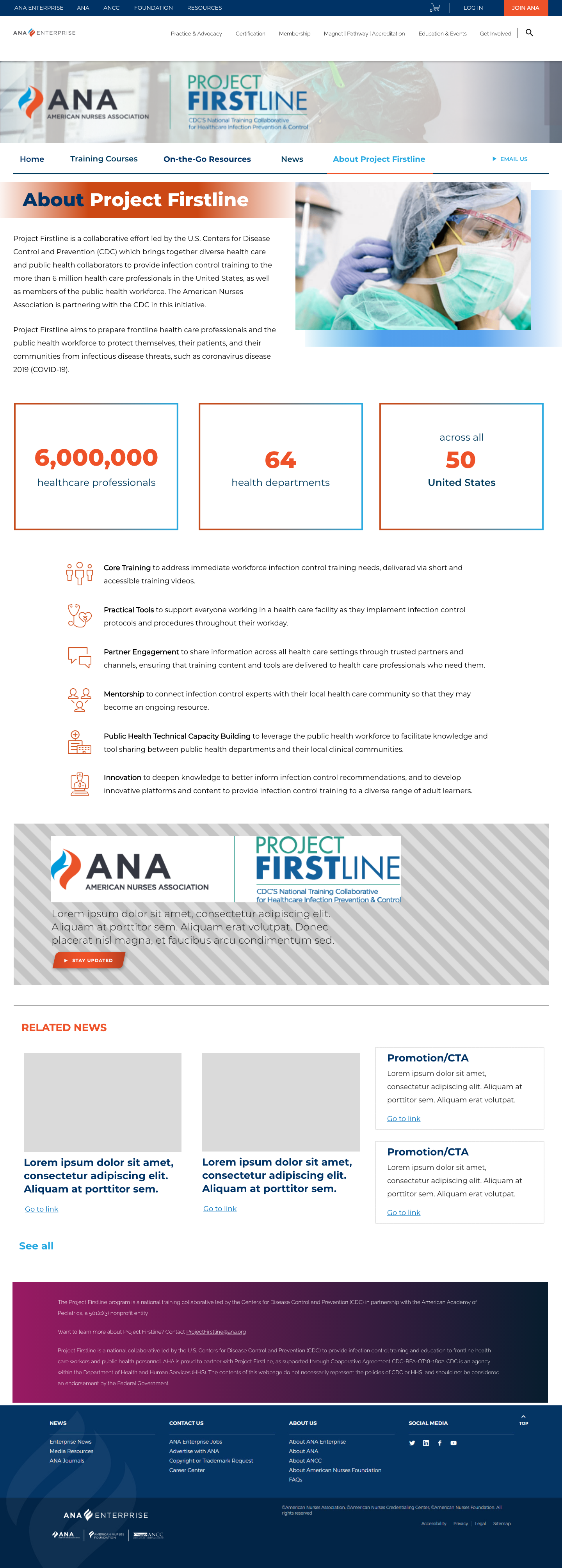
I also created interior pages for the journey I had outlined. These pages use the new concepts and components from the homepage, as well as preserving any existing styles that may serve the project.
THE MOBILE EXPERIENCE AND APP
MOBILE DESIGN
Previous iterations of the microsite didn’t spend a lot of development time on the mobile experience, which seemed very surprising given that the users are rarely at a desktop computer.
To correct this, I made sure that all of the components were built with a mobile-first mentality and included an example of the most complicated page utilizing the most components, a specific training topic page.
To make moving through the mobile page easier, and make content more discoverable, a page navigation was added borrowing from existing jump-link styling.
PROPOSED APP
NOTE: This is still under evaluation. In addition to a mobile web experience, I developed an app prototype to pitch the idea to pull out the training courses on their own so that busy nurses can log in, hammer out a training, and get on with their work.
The app is based on current content and features a very basic navigation. But if the idea is improved, I’d like to introduce more elements of gamefication such as account creation with avatars, creating nursing unit teams to compete with, social sharing, etc.
I would also like to tackle the content with the ANA team to do an entire design sprint on content creation, organization and implementation, with a mobile/app-first approach to how we display the content and which tools we use to power the backend.
A demo of the app used in the pitch can be found here: https://tinyurl.com/EAL-app.

Example of in-page navigation for mobile