James Miner Tattoo Portfolio Website case study
SKILLS: CLIENT MANAGEMENT, VISUAL DESIGN, COMPETITIVE ANALYSIS
TOOLS: PEN, PAPER, SKETCH, INVISION, SQUARESPACE
THE CHALLENGE
Create an easy to manage portfolio to showcase an up and coming tattooer and artist.
RESEARCH AND SKETCHING
Other than Instagram, the client didn’t have an online presence so I started with researching competitive websites and artists I knew he followed on Instagram. I sketched by hand sites I admired and studied what elements they included. Knowing that my client was just starting out, I wanted to be sure I covered everything he needed — and potential customers might expect.
The basics I had to include were:
Nav bar with home/artist info/portfolio/contact
A compelling hero image
Artist bio with action shot of artist
Portfolio
Either personal or studio contact info
While understanding how the site should function, I also examined what the sites looked like. I decided that I wanted to create a site with plenty of open space and room for the portfolio to breathe. It shouldn’t have a lot of written content, other than bio and booking information, and the mechanics of the site should recede so that the gallery can stand out.

Working with the client, I developed a neutral palette that highlighted colors found in classic tattooing (black, white, red) and requested images from the client that highlighted his work and design, but also showcased him working so that visitors would also get a sense of how he worked, in addition to what he did.
We also spent a great deal of time discussing the fonts and we decided that the display font should be a classic serif font (in keeping with the traditional tattoo art theme) and all of the body text would be an easy to read sans-serif.
INITIAL DESIGNS
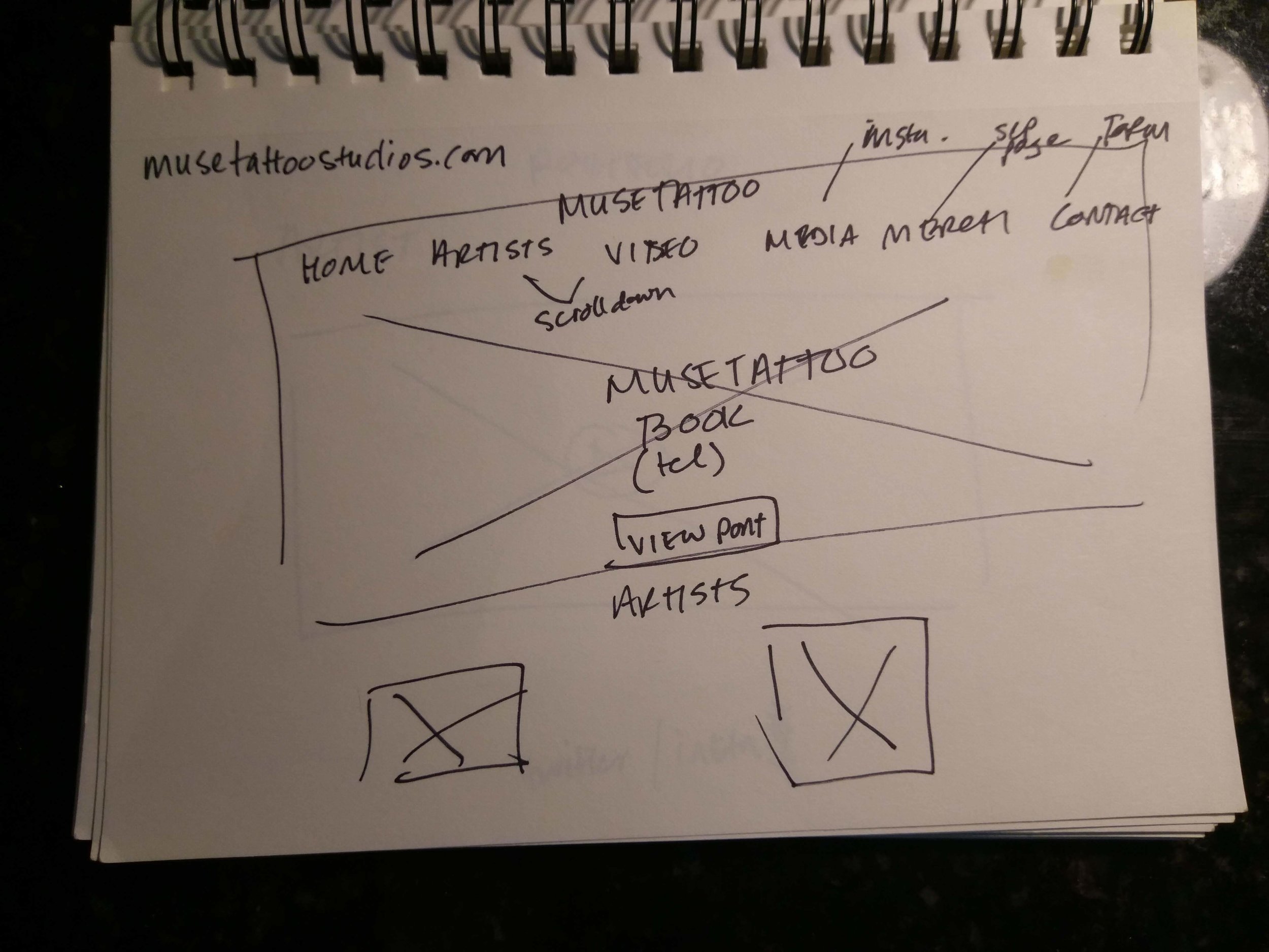
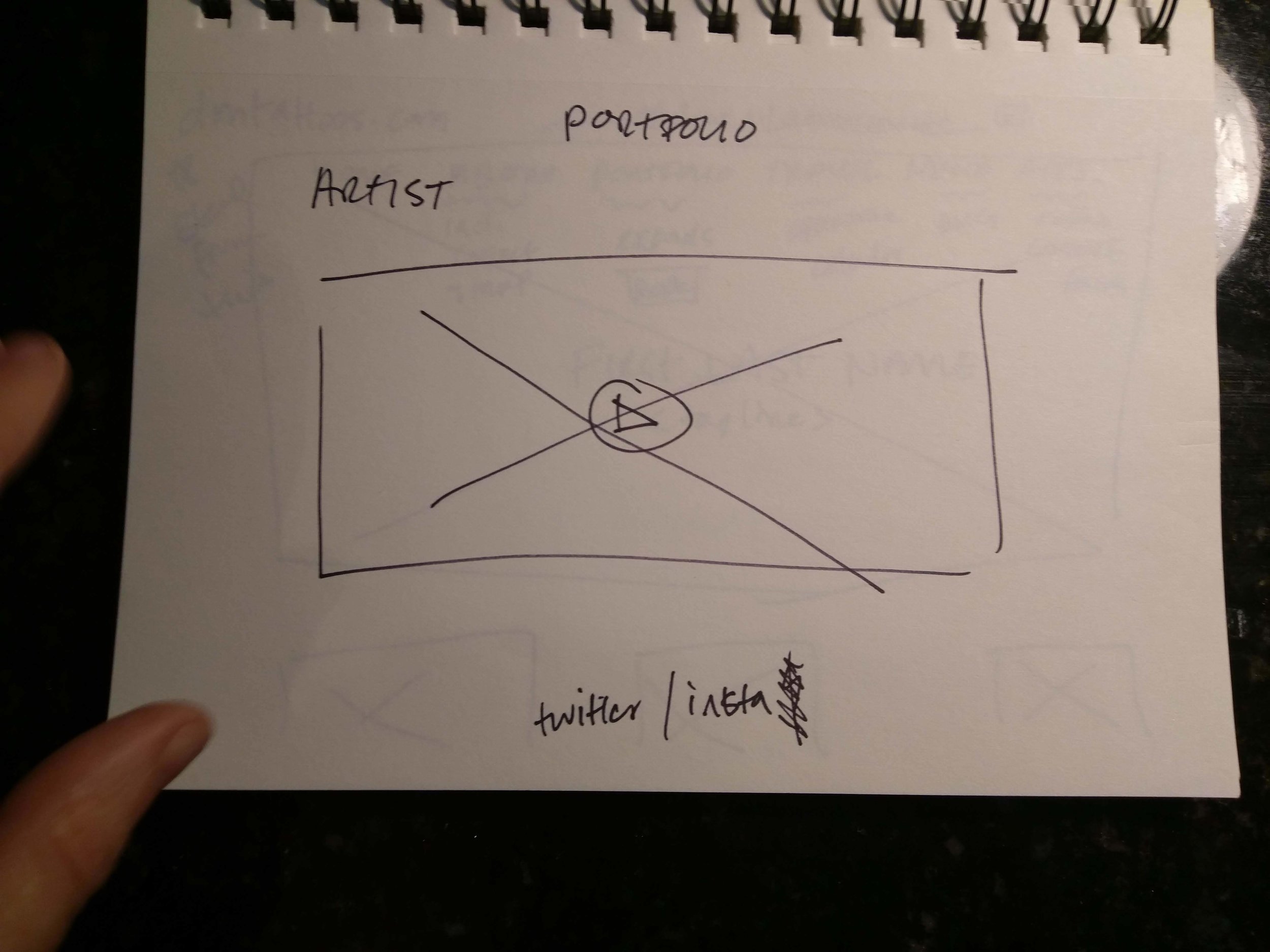
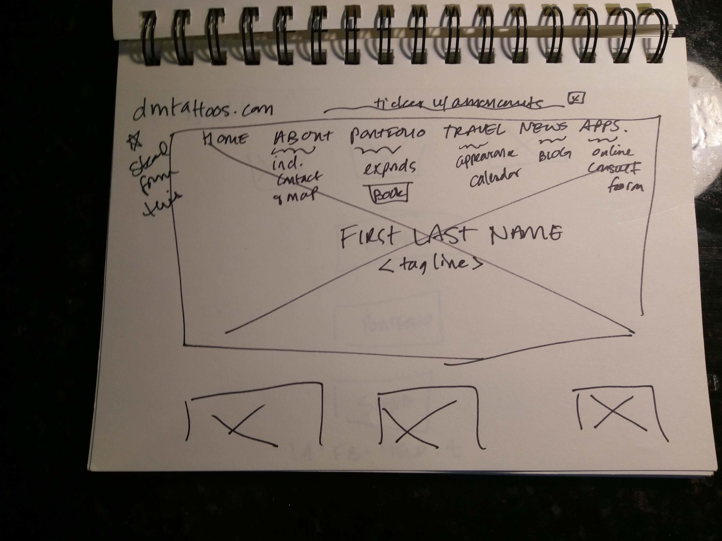
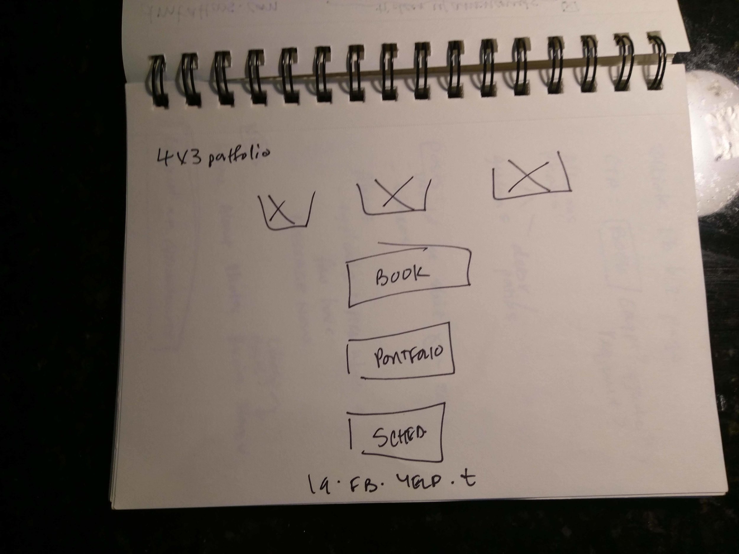
Once I had all of the pieces, I used Sketch to develop initial wireframes to start to puzzle out how this should all work together.

2/3 of the initial wireframes
Nav bar with home/about/portfolio/book
Home is the main page with a large focal (aka hero) image
About will jump down the page to bio
Portfolio can be accessed through the nav bar but also has dedicated space on the home page — when you click-through, this expands to larger images, and more of them. The home portfolio can thus rotate depending on what you want to feature while the main portfolio can have a more fixed set of content
I chose “book” instead of “contact” because I wanted a clear call to action with an online submissions for people to send initial queries and tattoo ideas; this would open them into an email or text conversation for further information
Footer with Instagram/Facebook/Email [each of these would open the standalone sites OR an email form]
Knowing that clients have a hard time seeing wireframes, once I was happy with the initial designs, I populated the wireframes with stock imagery and created a clickable prototype so the client understood how this very simple layout would work. For me, simplicity was key to this portfolio’s success but without understanding how the elements work together, I was afraid the client might think I missed something.

Clickable prototype: https://invis.io/ERGE52F8BWG#/285703751_Home
At this time, I set up a Google Drive so that he could easily share photos of his work and the body copy (bio, permissions, approval of questions on contact form) with me once we moved on to final development.

DEVELOPMENT
I focused on Squarespace since it is pretty well respected within the creative community and a number of the comps I looked at actually use it for their backend. And, given that the client didn’t have the time, interest, or money to learn and maintain a more robust platform, Squarespace seemed like a logical choice.
I used Chrome’s DevTools to inspect the sites I had originally looked at to find out which templates they were using. Unfortunately, my preferred template was no longer supported by Squarespace so I had to find an alternative and tweak it to get as close to the approved designs as possible. I also worked with the client to find an available domain name and purchase it — lucky for him, his name was still available, as a .com no less!
HANDOVER AND REFLECTION
Once I had gotten as far as I could with the content the client provided and the Squarespace template, we arranged a meeting so that I could handover the keys to his new car. I sat with him to show him how Squarespace worked, their simple photo editing tools and how to change or rearrange images, add pages, and resize text content and pick colors. We also went over pricing for website hosting and domain names; Squarespace gives you a discount if you host and buy the domain name from them, and if you sign up for a year at once, all of which my client was able to do. The handover meeting took almost three hours and he felt confident that he could easily work with this new tool. As a matter of fact, he immediately asked that we switch out the consultation form to a simple “contact me” button that opened an email since he wasn’t quite ready to court new customers. I showed him how you could hide an existing page from public view so he could resurrect that consultation form when he was ready.

Two artists at work
Working with this client was great, he was respectful and responsive, although I found that our face to face time was the most productive way of sharing ideas immediately and we actually changed the final site quite a bit at handover. It was also convenient that he and I share an aesthetic taste (NB: he’s done three of my tattoos) so I may have relied too heavily on us being creative kindred spirits and didn’t push my color choices as far outside of my comfort zone as I should.
It was great to help this budding artist start to see his potential full-time career unfold! Can’t wait to book him on his new site soon.